


You’ve probably landed on a website before and instantly felt lost.
Too many menus. Banners fighting for your attention. Pop-ups appear before you’ve even read a single word. You’re not sure where to click, what this site even does, or why you came here in the first place.
So you leave.
That’s not your problem. That’s a design problem.
And it’s exactly why minimalist design exists not as a trend, not as an aesthetic choice, but as a practical solution to one of the biggest frustrations people have on the web: not being able to find what they need quickly.
This article breaks down what minimalist design actually is, why it works so well for regular users, and what it looks like when done right. No jargon, no fluff, just the real reasons why simpler websites win.
Let’s clear something up first.
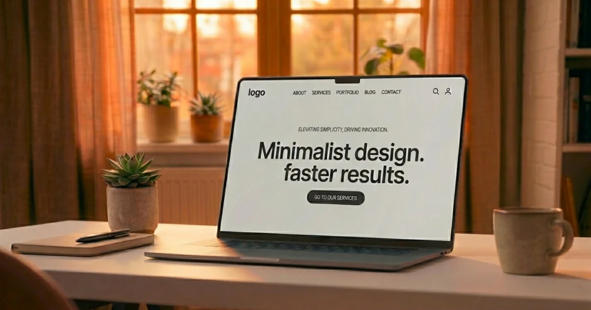
Minimalist design doesn’t mean empty. It doesn’t mean boring. It doesn’t mean a white page with one sentence on it.
It means every single thing on a page is there for a reason. If it doesn’t help the user do something or understand something, it gets removed. What’s left is a clear, breathing design that guides your eyes naturally from one point to the next.
Think about some of the most-used websites in the world. Google’s homepage is almost entirely blank. Apple’s product pages focus on one thing at a time. Wikipedia, despite having enormous amounts of information, has a simple layout that hasn’t changed much in years.
These aren’t accidents. These companies invest millions into understanding how people use websites — and they keep coming back to the same answer: less is more.
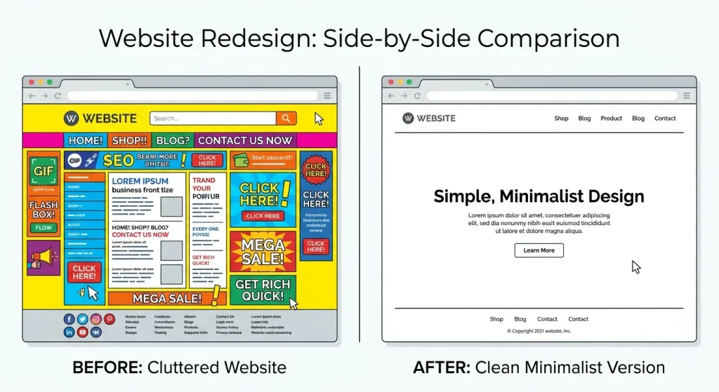
When you open a cluttered website, your brain has to work harder. It’s scanning dozens of visual elements at the same time — headings, ads, images, links, colours, and trying to figure out which one is the right path to take.
Psychologists call this cognitive load. The more choices you present someone with at once, the harder it is for their brain to choose. This is also known as decision fatigue, and it’s well-documented.
A minimalist design reduces that load. When there are fewer elements competing for attention, people can focus on the thing that actually brought them to the page.
Here’s a simple example. Imagine you’re looking for a recipe online. One website has a clean page with a photo, ingredients, and steps — that’s it. Another website has the recipe buried below six ads, three related article suggestions, a newsletter pop-up, and a video that autoplays in the corner.
Both have the same recipe. But you’re staying on the first one.
That’s the power of minimalist design in action.
Most people notice the difference between a clean and cluttered website right away, but don’t always know why. Here are five ways minimalist design helps users find things faster:
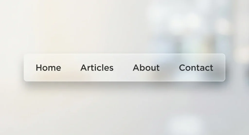
In a minimalist design, the navigation menu usually has five items or fewer. Each one means exactly what it says. There are no dropdown menus with dropdowns inside them, no mystery icons without labels.
When someone lands on a site and sees a clean top bar with three or four straightforward options, they can immediately figure out where to go. No hunting, no guessing.
Compare that to sites with mega-menus that expand into 40 options. Most users freeze and either randomly click something or hit the back button.
Simple navigation = faster decisions.
White space also called negative space, is the empty area around elements on a page. A lot of people assume it’s wasted space. It’s actually one of the most useful tools in web design.
When there’s breathing room around a headline, your eye naturally goes there. When a button has space around it, it stands out without needing to be bright red or flashing. When paragraphs have room to breathe, they’re easier to read.
White space acts like invisible signage. It quietly tells visitors where to look next without them even realising it’s happening.
Sites that cram everything together remove this invisible guide, and users end up wandering.
Every extra element on a page is a potential exit ramp.
If someone’s reading your article and a sidebar pops up offering them ten other articles, a newsletter form, a recent comments section, and an ad for something unrelated — you’ve just given them nine ways to leave before finishing what they came for.
Minimalist sites focus the user. They say: “Here’s why you came. Here’s what you need. Here’s the one thing to do next.”
That focus keeps people engaged longer, and it also helps them actually accomplish what they were trying to do in the first place.
This one is practical rather than visual.
Minimalist websites tend to have fewer images, fewer widgets, and fewer scripts running in the background. That means they load faster — sometimes significantly faster.
Studies have shown that users start leaving a website if it takes longer than three seconds to load. Every extra second after that increases the chance they’ll leave. A heavy, visually complex site with lots of moving parts takes longer to load. A clean, minimal one is often ready in under a second.
Speed isn’t just about user experience, either. Google uses page speed as a ranking factor. Faster sites rank higher. So minimalist design indirectly helps your site get found in the first place.

More than half of all web traffic comes from phones. And on a small screen, clutter becomes unbearable.
Minimalist designs adapt much better to mobile because they don’t rely on complex layouts or lots of side-by-side content. A single column of clean content, a simple menu (usually a hamburger icon), and well-spaced text — that’s all a phone user needs.
Websites built with minimalism in mind tend to be naturally mobile-friendly. Websites built with lots of design complexity tend to break or become unusable when you try to view them on a phone.
Since Google also uses mobile-friendliness as a ranking signal, this matters for visibility too.
It’s easier to see this with examples than to describe it in the abstract.
Bear Blog is a writing platform with almost nothing on the screen except the words. No sidebars. No ads. No author photo taking up half the page. Just the article. People love it because they can actually read.
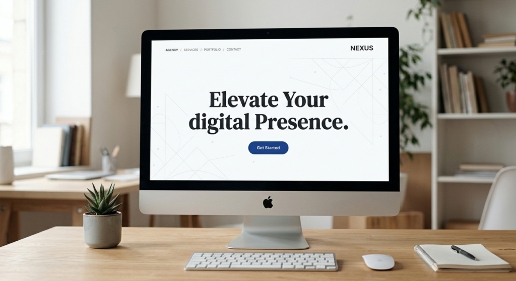
Notion’s homepage uses lots of white space, one clear headline, one short sentence of explanation, and one button. You know exactly what it does and what to do next within five seconds of arriving.
Linear (a project management tool) has one of the cleanest websites in the tech world. Every element earns its place. The result is a site that feels fast, confident, and easy to trust.
You’ll notice something these sites have in common: you don’t feel lost on them. You know what they’re about and where to go almost immediately. That’s not accidental — that’s minimalism doing its job.
Since this design style has become popular, a lot of websites try to do it without really understanding it. Here are a few things that look minimal but actually aren’t:
Removing helpful information. Being minimal doesn’t mean hiding things users need. If someone’s on a product page, they need the price, the description, and a way to buy it. Taking those away to look clean just frustrates people.
Using tiny fonts for “clean” aesthetics. Some designers make text very small and light grey to keep things looking spacious. But if users have to squint to read it, that’s not good design — it’s just inaccessible design.
Having one page with nothing on it. Some sites go so far in the minimal direction that they give visitors no information at all. A homepage with just a logo and a tagline doesn’t help anyone. There needs to be enough content for a person (and Google) to understand what the site is about.
Making important buttons hard to find. The goal of minimalism is to make the important things clear — not to hide them for the sake of looking uncluttered. Your main action (buy, sign up, read, explore) should always stand out.
True minimalism is about removing what’s unnecessary while keeping everything that actually matters. The test is always: does this element help the user, or doesn’t it?
Here’s something worth knowing if you’re thinking about your website’s future.
AI tools, including the kind that answer questions directly like ChatGPT, Perplexity, and others are now being used by millions of people to find information instead of using traditional search. These tools read websites and pull answers from them.
The websites they pull from most reliably are the ones with:
Sound familiar? That’s exactly what good minimalist websites do.
A cluttered website with a confusing structure is hard for humans to navigate, and it’s hard for AI to read and understand, too. A clean, focused website makes it easy for both.
So if you want your content to appear in AI-generated answers (what’s now being called GEO Generative Engine Optimization), building a simpler, clearer website isn’t just good for your visitors. It’s good for your visibility in the next generation of search.
If you have a website or are thinking about building one, here are real, simple steps toward minimalism:
Start with your homepage. Ask yourself: what is the single most important thing someone should understand or do on this page? Cut everything that doesn’t support that one thing.
Limit your colours. Two or three colours, used consistently, are enough. Every additional colour adds visual noise.
Cut your navigation down. If your menu has more than six items, look at what can be combined or removed. If an item is rarely clicked, it probably doesn’t need to be in the main menu.
Use real fonts, not decorative ones. Fancy fonts might look interesting, but they slow down reading. A clean, readable sans-serif font (like Inter, Lato, or Open Sans) serves your visitors much better.
Let images breathe. Don’t stack images side by side with no spacing. Give each image room around it, and make sure each one is there for a reason.
Delete one thing a week. A simple habit. Once a week, look at your site and find one element, a widget, a sidebar section, a link in the footer that isn’t serving anyone. Delete it.
Small changes compound over time. A website you strip back slowly and thoughtfully will eventually become noticeably cleaner, faster, and more useful.
There’s something else minimalist design communicates, beyond just being easier to use.
It signals that you know what you’re doing.
When a website is cluttered, it often feels like the person behind it is trying too hard, throwing everything at the wall to see what sticks. When a website is clean and focused, it feels like the people behind it are confident. They know who they’re for, they know what they offer, and they trust their visitors to get it.
That confidence is felt, even if it’s not consciously noticed. It builds trust. And trust is what makes someone bookmark your site, come back tomorrow, and eventually tell someone else about it.
The best websites in the world don’t shout. They don’t chase. They just make it very easy for the right person to find what they came for and then get out of the way.
That’s minimalism. And that’s why it works.
Minimalist design isn’t about making things look pretty. It’s about making things work better for real people in real situations, someone on their phone at lunch, someone quickly searching for an answer, someone trying to decide in five seconds whether your site is worth their time.
When you remove the noise, the right things rise to the surface. People find what they need faster, they trust you more, and they come back.
That’s the kind of website worth building.


Comments are off for this post.